Ways with Constable Green
- Beaumont
- Sep 7, 2022
- 2 min read
Earlier this year, Neptune welcomed Quince to our collection of paints. A vibrant, chartreuse-like colour just right to see in the start of spring. In much the same way, our newest colour, Constable Green, a deep inky green – created in collaboration with pigment maker Lucy Mayes and inspired by John Constable’s bucolic landscapes – embodies so much of autumn’s hunker-down mood. But what to pair this deepest of greens with? We’ve put together three palettes to make the very most of its dark and verdant nature.

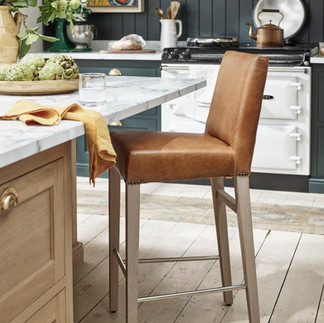
Constable Green, Salt and Saffron We turned to the kitchen to inspire the first of our colour pairings (though, of course, the same palette could be used elsewhere in your home too). Used on the cabinetry and wall paneling, deeply-pigmented Constable Green creates a cosseting, classic look which will sit very happily alongside natural wood tones like oak. In turn, creamy off-white Salt – a natural partner to so many bolder colours – brings a gentle and reassuring warmth to the palette. Combine with elements of Barnaby Saddle leather using our Shoreditch bar stools, or even a small armchair like Matilda if space allows, and finish with accents of Saffron for a really warm and grounded overall look.


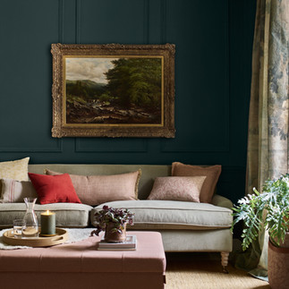
Constable Green, Cactus, Sage and Grouse This palette pairs Constable Green with other tones drawn from the natural world. Namely, Cactus, another of our green paints that’s a little lighter and cooler, but still deep and impactful used on walls; our Hugo linen in Sage, another green that’s paler still; and our Isla velvet in Grouse – a rich charcoal grey. For contrast, we’ve also introduced highlights of Mustard – an ochre shade with olive undertones – and our freshest white, Snow. If you’re looking to use Constable Green as the base colour, rather than as an accent in this palette, introducing it to the ceiling, and taking it half way down the walls, will create an inviting and intimate feel just right for a relaxed sitting room.


Constable Green, Paprika and Apricot We’ve brought the orange and pink sunset tones of Paprika and Apricot textiles together with Constable Green for a palette that’s warm, welcoming and ultra-cosy. These spirited shades – along with the natural warmth and texture of our Whittington hemp rug – help to balance out a scheme that uses Constable Green from top to toe on the walls. Try this combination in a darker aspect north-facing sitting room, bedroom or dining room.


Ready to start experimenting with Constable Green and the other shades in our collection? Order sample tins here.


Comments